A proposal to fix 26 product errors
in addition to
4 critical
user flows.
The aim of this proposal is to increase the number of deposits and average volume per user.
Showreel
Clients

Variational
$52M Raised & $30B Volume Monthly
Zero Fee Perp Trading Platform with an institutional focus.

Lombard Finance
$800M TVL
Powering the on chain BTC economy via Lending, Borrowing & Staking.

Somnia
$270M Raised
The 1M+ TPS Layer 1 for Real-Time DeFi & AI Agents.

Taostats
1.1M Unique Users
Official Block Explorer & Gateway to Bittensor.

Miracle
6.1B Perp Volume
Mobile-Native Trading for Crypto Perps & Global Equities.

Valantis
$7M Raised
Staking, Borrowing & Portfolio Margin for Hyperliquid Traders.

Arcadia
276B Impressions
Premier GTM studio for pioneering Ai, Crypto, FinTech & Consumer.
100+ Others
Design Audit
During our design audit the team explored the landing page, product and relevant flows to find errors within the design - not only from a user experience perspective but also from a visual standpoint.
A total of 30 errors were found, 4 of them being critical - places where we think you're actively losing revenue and user attention.
From there, we designed the solutions to 3 tiers of problems:
1
Deposit Experience:
Users lacked visibility into what was happening after initiating a deposit, even when the transaction was already confirmed on-chain, creating uncertainty around its status.
We also identified unnecessary steps and confusing fiat/deposit options.
We improved this by simplifying the deposit flow, surfacing the deposit address immediately, and introducing clear transaction status and progress states.
2
KYC Visibility:
Users who had not started KYC had no clear entry point, CTA, or indication of where they were in the process, making the journey feel opaque.
We improved this by introducing a clear KYC banner and simplifying the experience into four clear states: Not Started → In Review → Action Needed → Verified.
3
Onboarding:
The onboarding experience presented too much information at once and did not sufficiently adapt to users’ needs, experience levels, language, or goals - while also offering little initial motivation to stay or explore the product.
We improved this by breaking onboarding into clearer steps, capturing user intent and experience level early, adding language selection, and introducing an initial reward.

Before (Current Ouinex Designs)

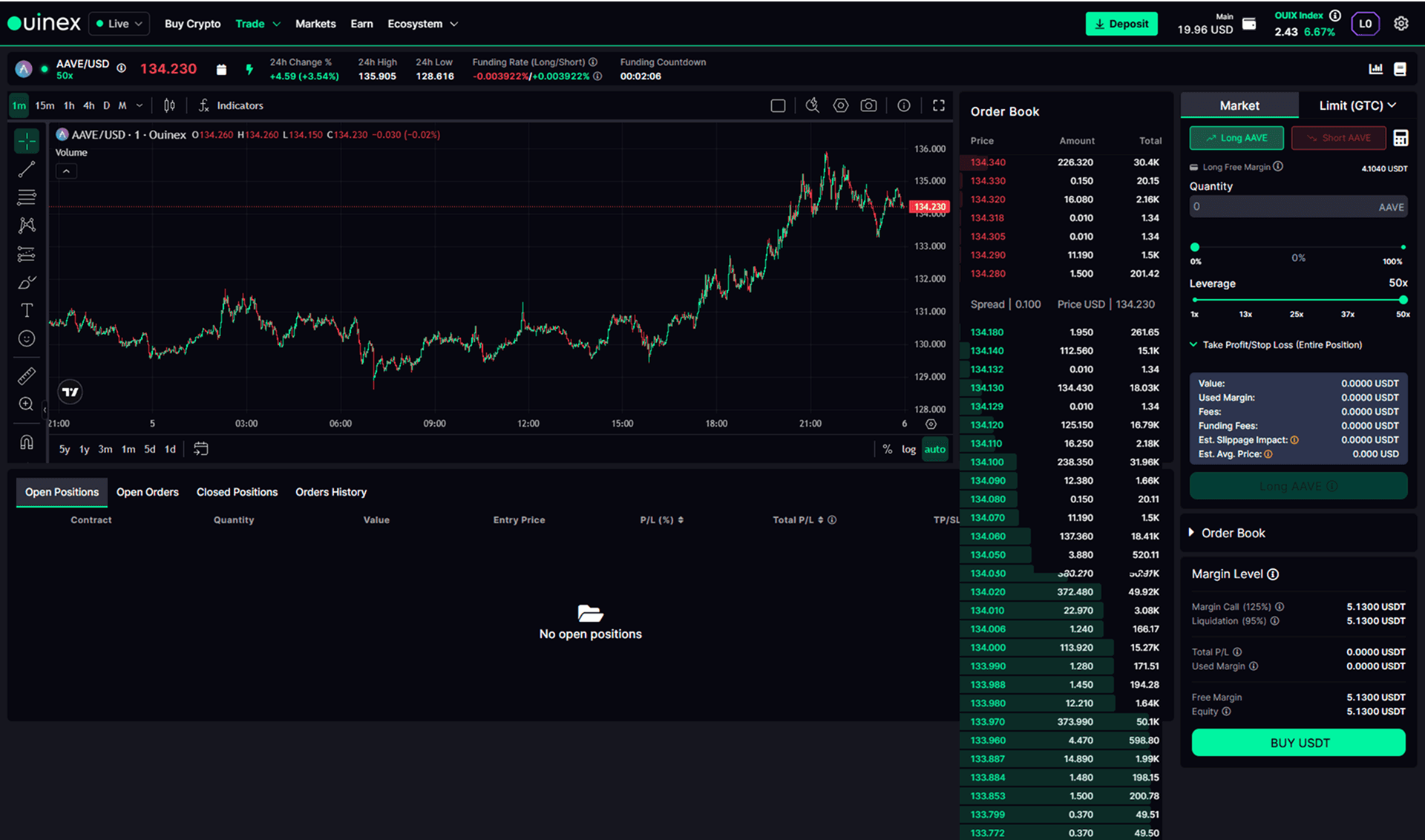
After (v21 Studio)


Objectives
Engaging with a team like ours requires key outlining of objectives to make sure that the investment you make is reflected in the impact that we make on your business commercially.
Here are the key goals that we've identified based on our initial discovery call:
1
Fix all outlining issues and ensure that the product is coherent and sealed so there are no revenue or attention leaks occuring.
2
Establish an up-to-date design system that can be carried across the whole entire application and marketing channels to make sure that it is on par with what the competition is doing in today's fintech space.
3
Establish measurable key identifiers of the above two objectives so that the investment that you've made can be measured as an ROI, example data points - avg. deposits or volume per user increasing.
To summarise the objectives it's all about maximising what your marketing team is already doing by attracting users and making sure that we optimise and maximise the amount of deposits and volume those users are already making (not only through the user flows but also a much more updated look).
All of these objectives are subject to what you think should be prioritised so nothing is set in stone. That's just what we've taken out of the discovery call we had initially.
Our Approach
One singular package that covers every design need you may ever need, here's how it works:
As part of our design packages you are allocated one project manager, a lead designer, and a support designer that works in the background just to support any gaps that might not be filled by the lead designer.
The project manager and supporting designer are there to patch over anything that might be need such as quality assurance on our side, and act as a bit of a shadow to make sure that the team runs smoothly.
The way our teams work is we can get integrated straight into your team and use whatever communication software you may be using, whether that be Telegram, WhatsApp, Slack, Teams, or whatever is required. Our team are more than capable and happy to join any sync-up meetings.
We are available between 9 and 6 pm European time and are more than happy to flex to accommodate any times, as we have clients all the way from New Zealand to America, Europe, Hong Kong, wherever that may be.
Once integrated into the team, the way it works is you give us design requests.
Our team internally gives you the timeline to produce that and we make sure we always send you daily updates on how our progress is going. That way when you set us a task on a Monday that's due on Friday, you don't just get it on Friday but you get daily updates on how that task is going.
1
Team allocation - for this type of retainer you'll be allocated one Head of Operations/Project Manager, one Lead Designer, and one Supporting Designer, with the majority of the work being done by Natalie and David.
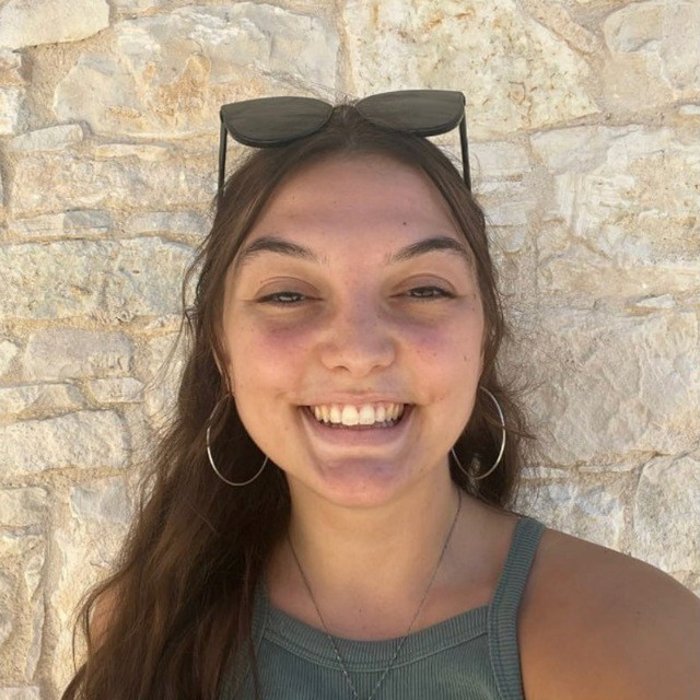
Natalie
Head of Operations
Worked with over 100+ clients, here to ensure briefs are tight and deadlines are being met.

David
Lead Product Designer
Worked with over 50+ fintech products specifically, including Lombard, Miracle & Sigma Trading.
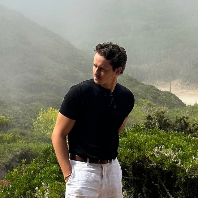
Victor
Supporting Designer
Here to support with smaller tasks and ensure thorough QA of work being submitted - always great to have a fresh perspective.
2
A higher-trust global presence - the redesigned experience better reflected the scale of the protocol and made the company accessible across seven languages and regional markets.
3
A stronger platform for growth - Variational gained a cleaner, more flexible digital foundation for investor conversations, product launches, community engagement, and future localization.
The community response was highly positive, with users commenting publicly on the new visual direction and overall quality of the experience. The website launched ahead of Variational’s next major growth phase, after which the company went on to raise approximately $50 million in Series A funding.
We do not claim the website caused the raise. We built the asset that helped the company present itself at the level it was preparing to reach.
Project Gallery