

Book a call


How v21 Studio reimagined Hyperliquid's onboarding so
an independent concept study.
Introduction
Opportunity
Getting attention isn't Hyperliquid's problem. Turning it into understanding is.
Between April and June 2026, the number of new wallets on the platform nearly doubled. The number of them trading in any given week barely moved.
Our read: a lot of people show up, look at a screen full of numbers they can't decode, and leave before anyone has told them what a perp is.
1
Start in their language:
Over 80% of the world doesn't speak English. So language is the first thing we ask, before anything about trading.
A newcomer who can read the product is already further than most get today.
2
Teach the product inside the product:
Ask how familiar they are with trading, then walk them through the screen piece by piece: the chart, the order book, the order form. Newcomers get the full tour.
Experienced traders skip it in one click.
3
Make funding the easy part:
Once someone understands what they're looking at, nothing should stand between them and a first trade.
Hyperliquid's Current Onboarding
01 - Tap on 'Connect'

02 - Connect Wallet

03 - Onboarding Complete

Solution 01
A guided first session, built into the product itself.
A newcomer no longer lands on the terminal cold. They're welcomed, they choose their language, they say how much they've traded, and the product walks them through the screen one part at a time.
By the time they're asked to deposit, they know what they're depositing into.
Desired Result:
Nobody has to figure out Hyperliquid alone.
A welcome, a language they can read and a tour pitched at their level take a newcomer from "what is this?" to knowing what every part of the screen is for.
Each step explains one thing and the "Skip" button is always there, so beginners get the full picture and experienced traders lose no time.
By the deposit step, people know what they're funding. The aim is simple: more of the newcomers who arrive stay, fund an account, and come back to trade.
Welcome
The terminal is still there, blurred in the background, but the first thing a newcomer reads is a greeting and one line on what Hyperliquid is. There's a single button, so there's only one thing to do next.

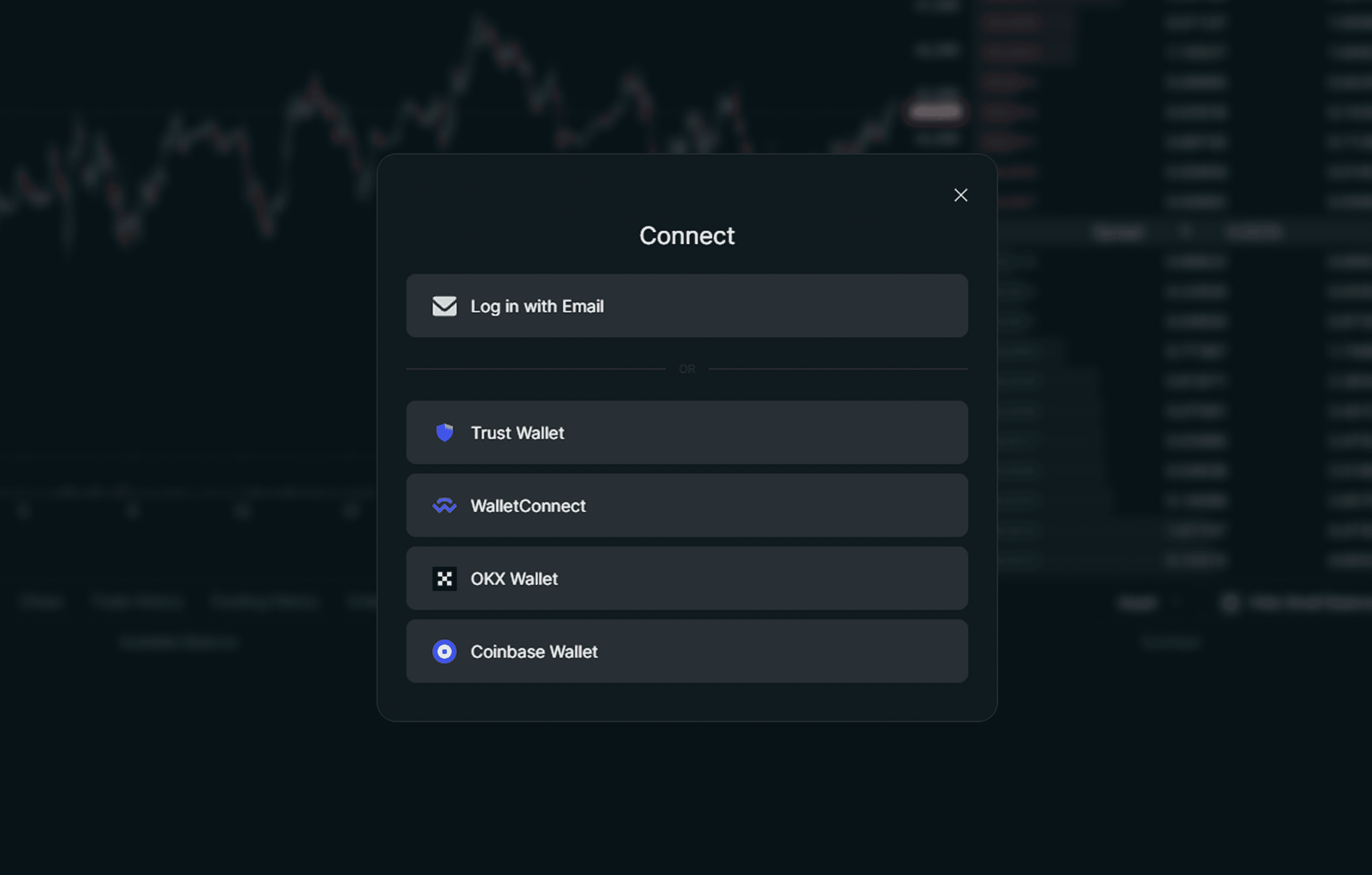
Log in
Email comes first, with wallets listed underneath. Someone who has never set up a wallet can get in with what they already have, and someone who has one is a click away.
Language
Over 80% of the world doesn't speak English, so language gets its own step, with nine options and the mascot holding up a welcome sign. It's a small screen that changes everything after it, because every explanation that follows is one they can read.

Experience
One slider, from "not so experienced" to "very experienced". It takes a second to answer and tells the product who it's talking to. Beginners get every step explained. Experienced traders get the short version.

Guided tour
The product lights up one part of the screen at a time and dims the rest: the market overview first, then the order book and so on. Each stop has a title and two lines of explanation. The mascot stays in the corner throughout, and Skip sits next to Next on every step.


Deposit
Two options in plain words. Transfer crypto from an exchange or wallet, or buy USDC with a card, Apple Pay, Google Pay or a bank transfer. People without any crypto can still fund an account in a few taps.


Findings
We didn't want to assume this would work, so we tested it.
We tested the current onboarding with three types of user:
Perp Veterans (Individuals who have a considerable amount of experience trading onchain markets with substantial volume)
Crypto Natives (Individuals who use crypto on a weekly basis, not necessarily traders)
Complete Beginners (Little to no crypto experience)
How did we test our solution?
We took the same three user types and split each one in two.
One group used Hyperliquid's existing flow. The other used our redesign, built as a Figma prototype.
Everyone had the same three tasks: connect a wallet, deposit, and trade. We measured how long it took and how well they understood the product.
What did we find?
Complete Beginners:
61% faster
28 minutes -> 11 minutes
Product comprehension tested 80% higher.
Crypto Natives:
44% faster
9 minutes -> 5 minutes
Perp Veterans:
No change
They barely noticed it existed. Exactly as designed.
The gains scaled with the need. Beginners improved the most. Natives improved meaningfully. Veterans weren't slowed down at all.
What we'd love to do differently next time?
We tested with a sample size of 12, so a bigger sample would make the results more reliable. We'd also quiz people before they start, to show how much they learned from the onboarding itself and how much they already knew. And we'd run both versions as working products, like a true A/B test, instead of comparing a live site against a Figma prototype.
Conclusion
We left the trading terminal alone on purpose. Hyperliquid already works for people who understand it.
The opportunity is everyone who doesn't understand it yet, and we think most of them can be brought up to speed before their first deposit.
What you've seen here is only the first part. We also explored what comes after onboarding: guiding people toward a first action, whether that's trading, earning, or managing a portfolio. That deserves a study of its own.
None of this is specific to Hyperliquid.
If people are arriving at your product faster than they can understand it, start with their first five minutes, and teach them at their own level.
Seen enough?
Let’s build something worth scaling.
If you’re looking for a sharper brand, clearer product, or a website that makes people pay attention, let’s talk!