
Turning Product
Friction
Into More Deposits & Volume
A proposal to help improve key user journeys, strengthen the product experience, and support Helix’s growth objectives.
Showreel
Clients

Variational
$52M Raised & $30B Volume Monthly
Zero Fee Perp Trading Platform with an institutional focus.

Lombard Finance
$800M TVL
Powering the on chain BTC economy via Lending, Borrowing & Staking.

Somnia
$270M Raised
The 1M+ TPS Layer 1 for Real-Time DeFi & AI Agents.

Taostats
1.1M Unique Users
Official Block Explorer & Gateway to Bittensor.

Miracle
6.1B Perp Volume
Mobile-Native Trading for Crypto Perps & Global Equities.

Valantis
$7M Raised
Staking, Borrowing & Portfolio Margin for Hyperliquid Traders.

Arcadia
276B Impressions
Premier GTM studio for pioneering Ai, Crypto, FinTech & Consumer.
100+ Others
Design Audit
During our design audit the team explored the landing page, product and relevant flows to find errors within the design - not only from a user experience perspective but also from a visual standpoint.
A total of 26 errors were found, 5 of them being critical - places where we think you're actively losing revenue and user attention.
From there, we designed the solutions to 3 tiers of problems:
1
Brand & Social Presence:
The current banner, logo, and pinned video work, but lack the visual polish needed to communicate a premium brand.
Improving these key touchpoints would strengthen perceived brand value and build greater trust with users coming from social media.
2
Leaderboard & Referrals:
The leaderboard and referral experiences feel functional but visually underdeveloped.
The current UI and use of poor 3D elements reduce the overall perceived quality and make these features feel less engaging than they could be.
3
Onboarding:
The current onboarding experience is largely non-existent, leaving users to discover the product on their own.
This creates unnecessary friction and can increase the time it takes for users to reach their first meaningful action.

Our Solutions

Product Design Studio
Motion
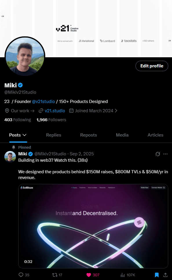
New showreel, banner and pinned post generated
$176,000
in revenue since posting.
We managed to generate leads and revenue from web3 founders click on our profile loving the work and booking in a call, this was all tracked using our booking link data CRM.


Bittensor Data Company
Re-designing a data heavy product from A-Z for
1M+ unique users.
Since our team taking over the teams social media posting we managed to organically generate 607% more impressions than their previous month leading up to their re-design announcement coming this month.


Turning Pacifica’s
$9 billion
monthly trading volume into a social arena.
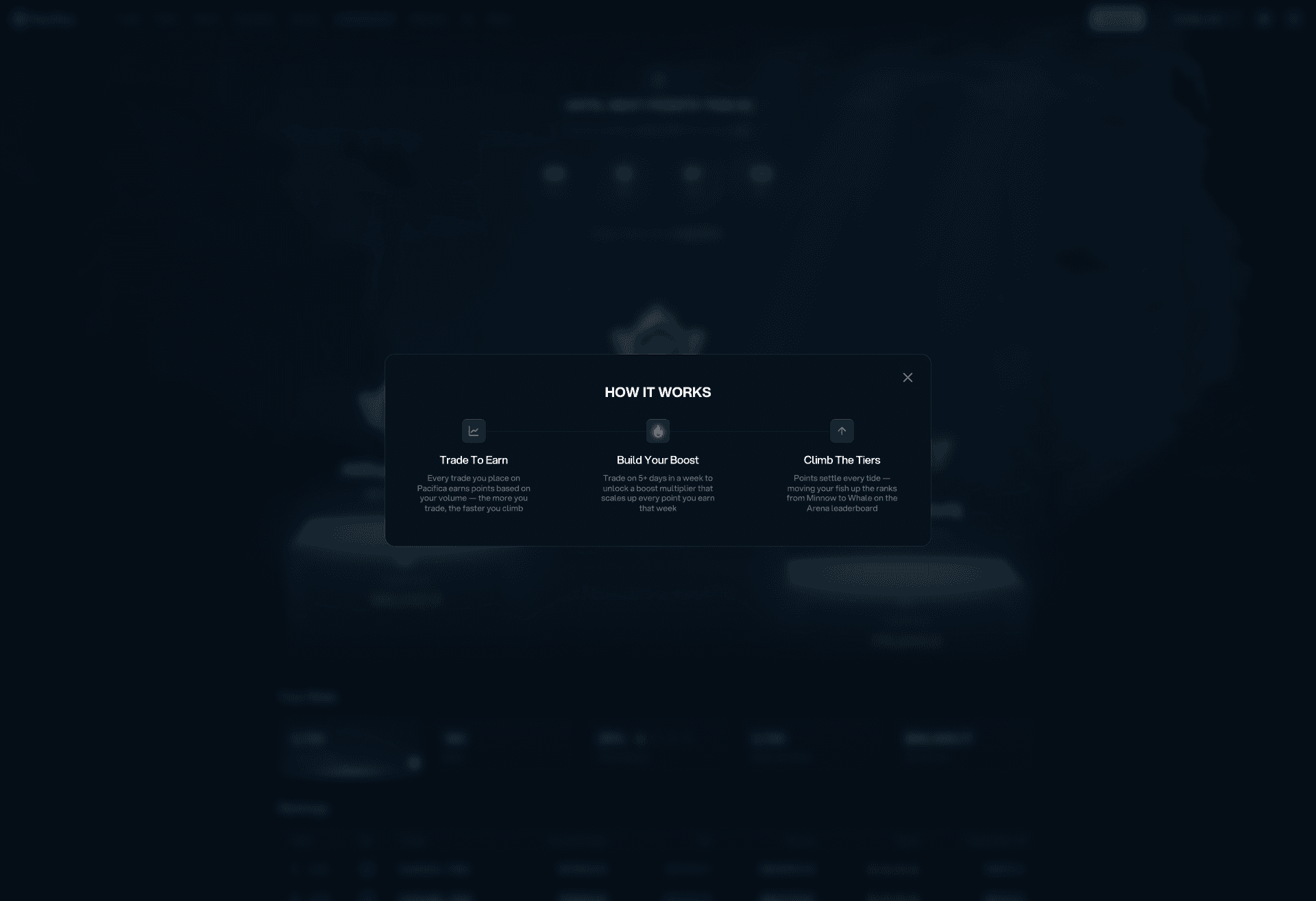
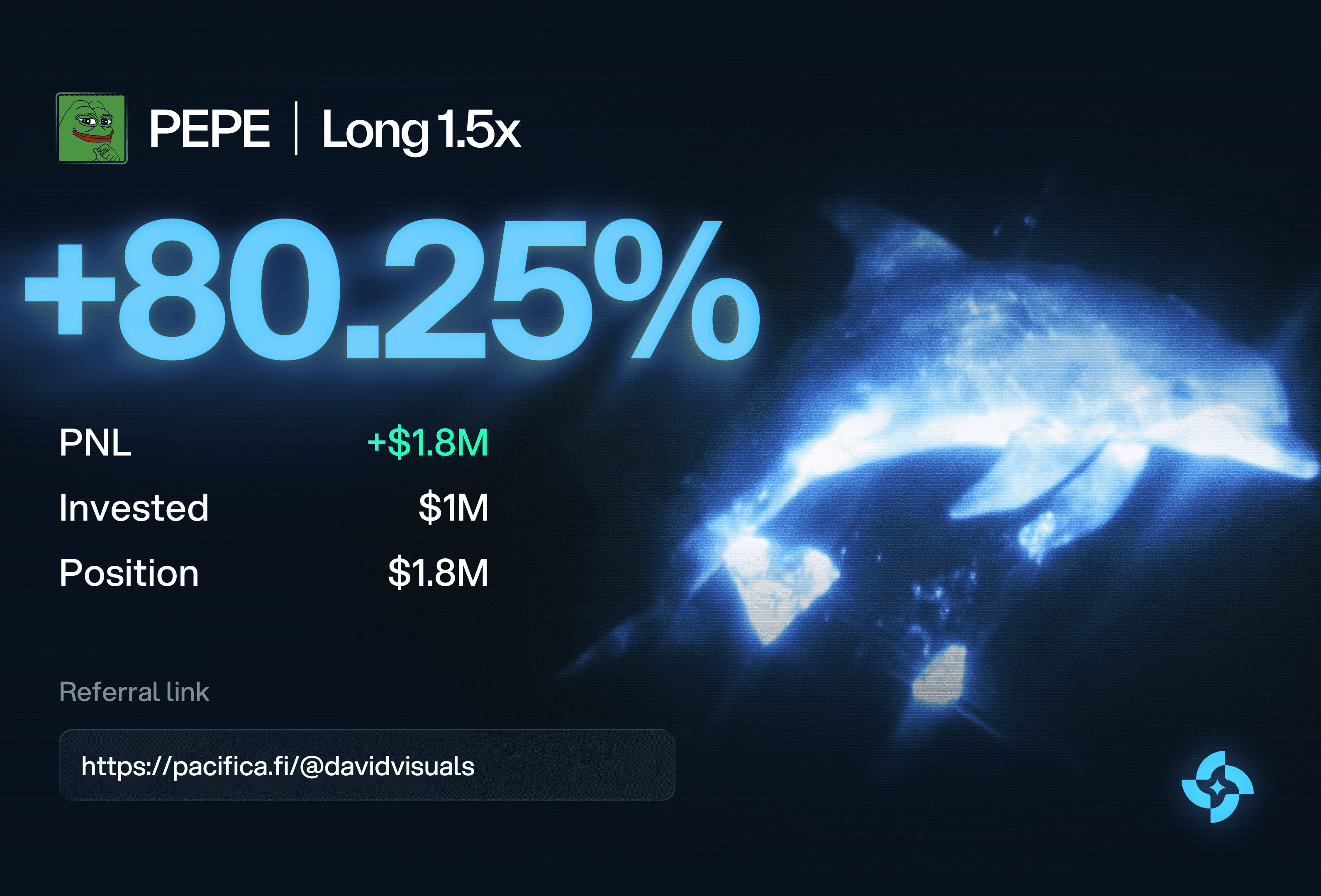
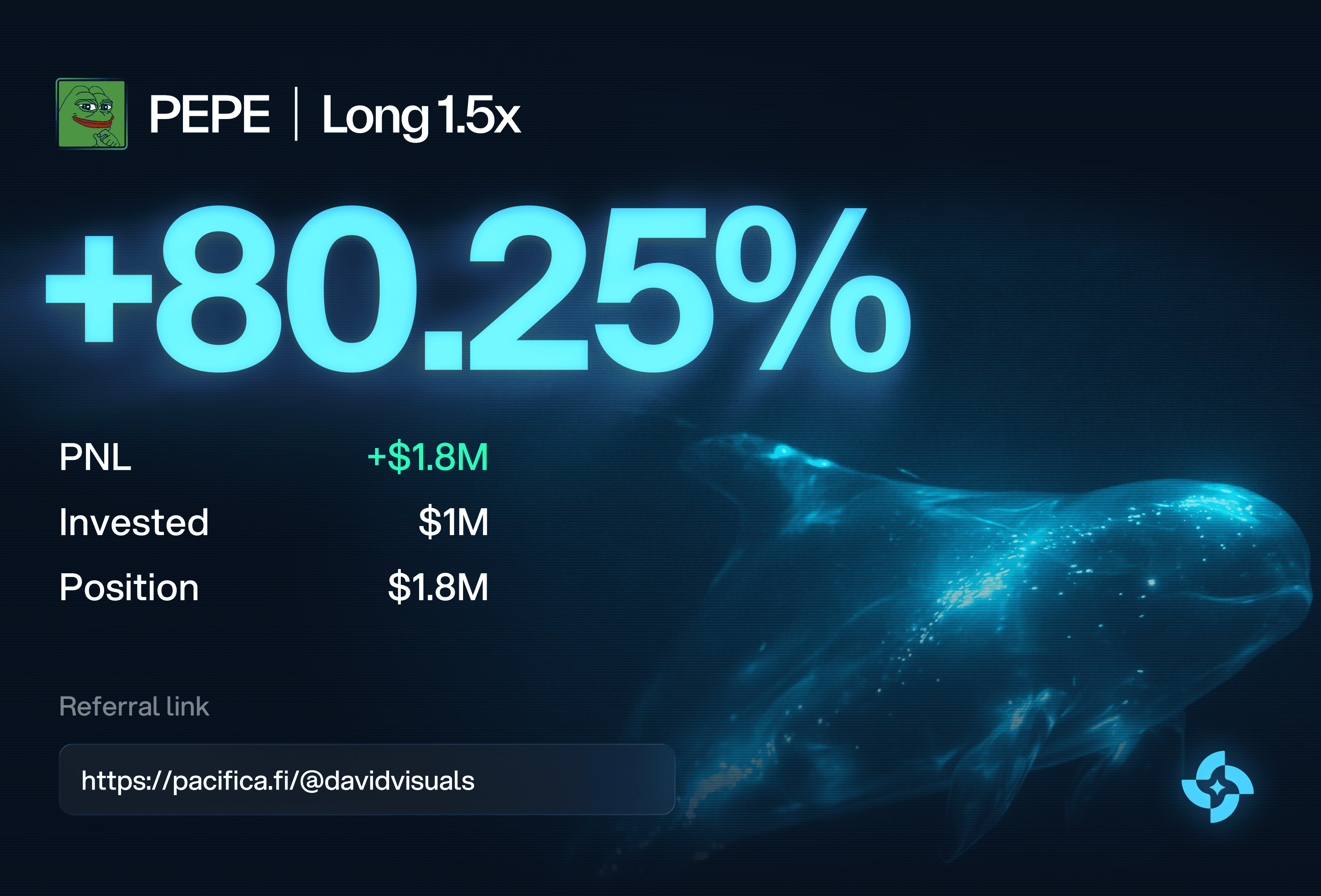
We independently reimagined Pacifica’s points page, transforming it from a passive spreadsheet into a live leaderboard built around competition. Traders can see who’s climbing, who just overtook them, and who’s close to taking the top spot, giving every trade more visibility, context, and social stakes.
Before (Current Pacifica Designs)


After (v21 Studio)




Taking Hyperlend's time to activate from 24 minutes just down to
9 minutes
.
With the founder of Hyperlend we identified a core issue of users not knowing what to do once they access the application as the UX was super confusing. When testing with average crypto users it took individuals on average 24 minutes to complete a deposit, borrow and bridge, with huge time loss occurring dude to bad UX. So we fixed it!
Before (Current Hyperlend Designs)


After (v21 Studio)


Objectives
Engaging with a team like ours requires clear objectives to ensure that the investment you make is reflected in measurable commercial impact.
Here are the key goals that we've identified based on our initial discovery call:
1
Increase deposits and trading activity:
Create clearer UX/UI moments that encourage users to deposit more - whether they have low funds, have just lost a trade, or are being onboarded.
By making the path to depositing clearer and more contextual, we can increase deposits, trading volume, and ultimately revenue.
2
Drive new user acquisition:
Improve the referral experience and ensure it is clearly surfaced throughout the product, giving existing users a stronger reason to invite others while making the value proposition compelling for users considering a move from competitors.
3
Increase user retention:
Introduce a points (ranking system) and incentive system that gives users an ongoing reason to return, trade, and engage with the platform - helping reduce churn and increase long-term user value.
To summarise, the objectives are focused on maximising the value of every user your marketing brings in: getting more users activated, increasing deposits and trading activity, and giving them stronger reasons to stay.
All of these objectives are subject to what you think should be prioritised so nothing is set in stone. That's just what we've taken out of the discovery call we had initially.
Our Approach
One singular package that covers every design need you may ever need, here's how it works:
1
Team allocation - for this type of retainer you'll be allocated one Head of Operations/Project Manager, one Lead Designer, and one Supporting Designer, with the majority of the work being done by Natalie and David.
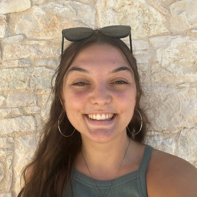
Natalie
Head of Operations
Worked with over 100+ clients, here to ensure briefs are tight and deadlines are being met & ensures feedback is being looped in.

David
Lead Product Designer
Worked with over 50+ fintech products specifically, including Lombard, Miracle & Sigma Trading.

Victor
Supporting Designer
Here to support with smaller tasks and ensure thorough QA of work being submitted - analysing data we gather from users.
2
How we collaborate - we get integrated straight into your team and use whatever communication software you like, whether that be Telegram, WhatsApp, Slack, Teams etc.
Our team are more than capable and happy to join any sync-up meetings - no matter the time zone we can make it work!
3
How work is requested - feel free to @ our team in any chat or any meeting and request any design work needed.
Natalie will then make sure that brief is coherent and the team will begin work.
That way we communicate a clear deadline with yourself and when you can expect the next update.
Like always, everything is an open conversation. If something needs to be prioritised please do let us know!
4
Submissions & revisions - every day you will receive an update on how the work is moving.
If you have any revisions we typically aim to get them done same day if our time zones align.
5
What work is included - this retainer doesn't only cover product design but also any kind of static design, whether that be:
graphic design
social media posts
banners
events-based designs
product design
landing page design
Quote
$6,750
/per 4 weeks
The retainer is paid upfront at the start of each 4-week period.
This engagement is designed to improve the highest-impact product and user experience issues across Helix’s priority customer journeys.
Upon approval we will start off with the kickoff prioritisation meeting. Jot down all of the fixes and all of the key focuses that we should do, making sure that the Figma is dev-ready for your development team, and start tackling the fixes one by one quickly.
Our recommendation is that we trial this for 1 month, we are very confident in the product that we provide, hence why we have all of these happy customers.
Please see the testimonials below.
Testimonials

Lucas
Variational, Sep 2026
It was great working with the V21 team, they're very professional and provide quality work no matter the request

Matrica
Jan, 2026
We actually very much liked the process and the communication between the teams. We had some nightmare experiences with other teams, and none of the red flags were present with v21.

Brittany
Taostats, Aug 2026
V21 is extremely responsive, communicative, and overall talented. It’s rare to find a design partner who cares so much about the work they’re delivering, and it shows.

Max
Variational, Sep 2026
We've worked with v21 for website rebuilds twice. Their team is efficient and easy to work with!

Derek
Neutral Trade, Nov 2025
I've been really happy with the V21 team. From the start, they were super professional and easy to work with. What stood out most was how open they were to feedback, which made the whole process collaborative and stress-free.

Juan
Ark Media, Dec 2024
Unlocking the lead capture a website hold has been something I greatly appreciate now that it's brining in leads to my business. Loved working with Miki and the team, super quick delivery!
Selected Works

Designing a new website ahead of a
$50M Series A.
We redesigned and localized Variational’s website across 7 regional markets, helping make the product clearer and more compelling for a global audience. We also created motion graphics to support multiple product launches.
Re-designing a data heavy product from A-Z for
1M+ unique users.
Our focus was simplifying dense, data-heavy experiences so users can understand, navigate, and act on complex information with less friction ahead of the new product launch. Our case study will be released post-launch of the redesign in October 2026.

Making
1.1+ PB
of decentralized storage feel simple.
We redesigned the Hippius experience around one core challenge: making decentralized storage understandable and usable at scale. We translated a complex infrastructure product into a clearer, more approachable experience for users storing, managing, and interacting with data across the network.

Launching ChainGPT's AI Hub V2 leading to
250K+ impressions.
We created a motion-led launch video that made AI Hub V2’s dense product story clear, engaging, and easy to follow, generating over 250k+impressions and 1k+ likes.

Making
Bitcoin
yield impossible to ignore.
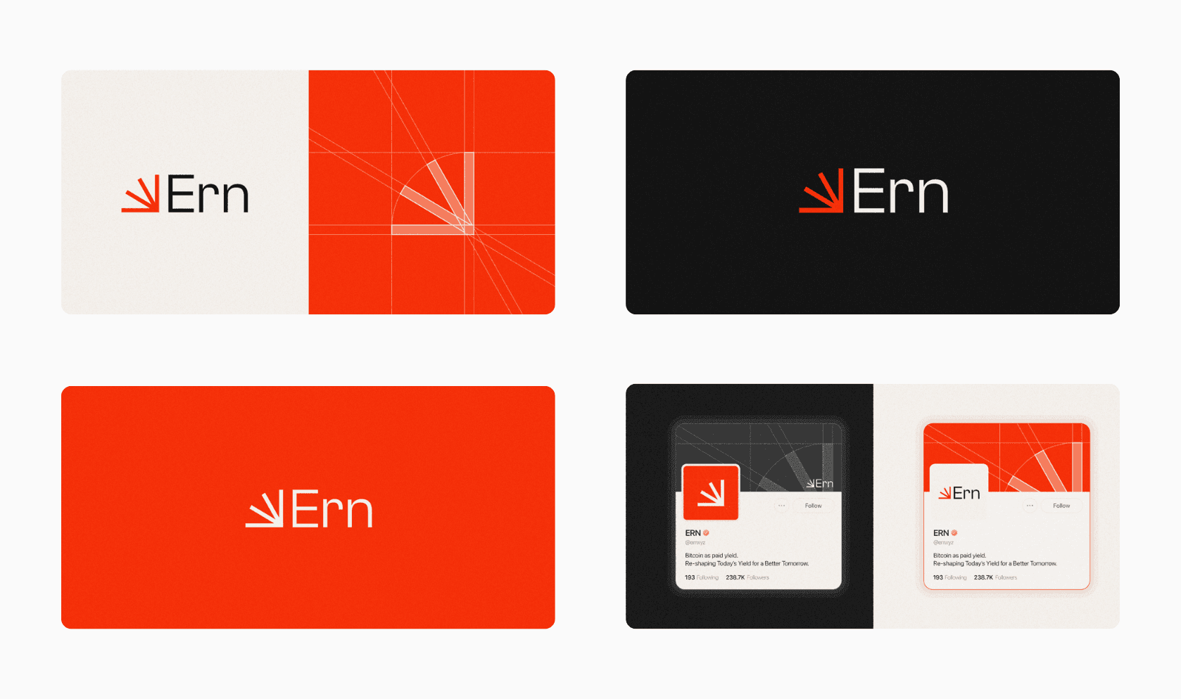
We developed Ern’s visual identity financial performance feel clear, energetic, and easy to understand. The brand system included a yield simulator and performance visualizations that simplified complex data.

Building the mobile app behind $6B+
$6+ billion
in perpetual trading volume.
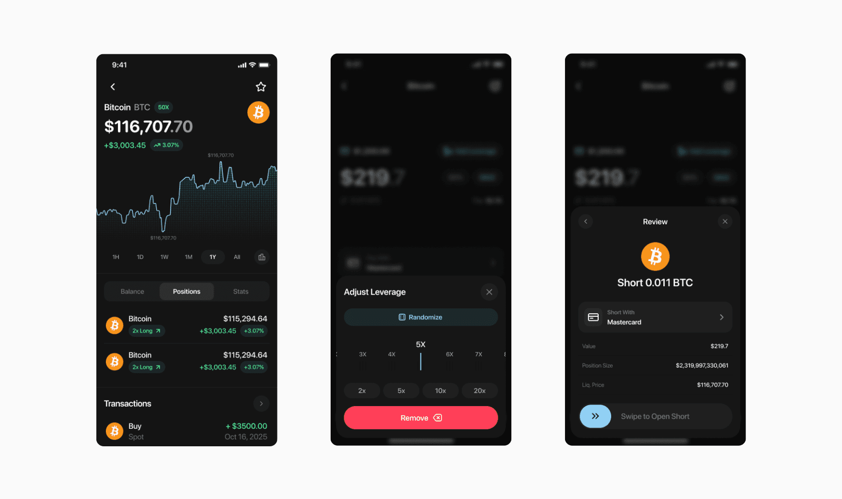
We delivered Miracle’s complete brand and product ecosystem, spanning visual identity, mobile and web apps, product design, and social media assets, creating a cohesive experience for the ideal user type.
Seen enough?
Let’s build something worth scaling.
Feel free to let us know how you feel about the proposal and if moving forward is a great decision to make.